Sunday, 22 February 2015

Construction Post: Locations (Ciara)


Locations:
When deciding where to film our thriller opening, we came to the conclusion of two settings. The first one being our friend, Cameron's house (top) and the second being a park (bottom), both of which met the standards needed for successful positioning and lighting.


Cameron's house will be used for the beginning of our thriller opening, whereby the main character leaves the house to walk her dog. This allows us to create shot reverse shot and some over the shoulder shots. From the pictures shown above, Cameron's house is a typical, standard house, which we thought was perfect as it highlights the normality of the main character's everyday life. However, this creates dramatic irony for the audience as they know something isn't quite normal.


The park is where the majority of our opening will be filmed because it will provide us with a wide, open space; allowing more room for different angles of each shot. This way we can also stick to our plan to film each shot 3 times in different angles, so when it comes to editing we will have a variety of shots to choose from. We will also be filming in the park during the evening, while it is dark, to create an eerie atmosphere, that conforms to our overall plot.


Saturday, 14 February 2015

New Idea Summary (Group)


New Plot:
Maddie is your average teenage girl, trying to balance her studies with her social life, hoping to live up to the high standards set out for her by her parents. But Maddie's life isn't all as normal as it seems, she has a stalker. It all started on the evening on 16th March 2015, she was taking her dog Molly for a walk when Molly became uncontrollable and ran away, after hours of searching she saw Molly, she found her with a note attached to her collar... the note changed everything. 
Maddie started receiving constant texts, letters, emails and notes from an anonymous figure that signed every message with - B xo, demanding she carries out certain tasks or someone will get hurt. As the story unravels the stalkers messages get more and more vivid and scary, Maddie doesn't know what to do, if she tells someone she knows somebodywill get die. The stalker leaves Maddie with a huge ultimatum, where both outcomes lead to someones death, but will Maddie be able to identity the stalker in time or will she have to watch a loved one get ripped out of her life? 


OPENING PLOT:


Friday, 13 February 2015

Changing Our Idea? (Group)


Why did we change our idea?

After attempting to film the first scene to our thriller we quickly realised that it wasn't working, it didn't come across as professional, the lighting didn't project well in the room and the initial idea that we thought was good now looked unrealistic.
We went back onto Final Cut Pro and attempted to piece shots together and the more we tried to merge the shots the more amateur it looked. We began to brainstorm ways of improving or altering the plot to make it appear more polished and none of our ideas seemed strong enough to make our opening as high quality as we hoped for.

It is then we contemplated thinking of a whole new idea, I put forward a basic opening plot that would be relatively easy to put together and would be a good platform to show off our knowledge and understanding of media and production. After doing a brief overview and seeing how quickly we would be able to the idea into action we decided to go ahead with the idea, as we felt we would be able present our skills better.


Shots From Original Filming:


Audience Feedback of original idea:


Discussing A New Idea:

Initial Opening Pitch/Animatic (Group)


Original Group Pitch: 


AUDIENCE FEEDBACK: How We Will Improve
  • One point raised was the title, "Psychotic." Some people thought that it may have connotations with the hit thriller "Psycho." After hearing this feedback we decided to brainstorm a few more titles and came to the conclusion that we will call the film "Unhinged"as it is more original. 
  • After some consideration we decided to take the audiences advice and use two cameras to film the cutting of the hair, to make these shots appear more realistic. Also, we know it may be difficult to film as we only have one shot at it, therefore, if it doesn't look professional we will rethink including this shot.
  • Some actors may not feel comfortable performing some shots, such as kissing one another, therefore, we may change this slightly and do other affectionate poses.
  • The setting was raised as a concern, however, with careful planning and jump cuts we noticed we could cut the settings down to two locations. 
  • Finally, we understand that our concept would be seen as stereotypical, however, we are going to play on stereotypes used to twist the conventional "psycho ex"plot. 

Previous Animatic:


Wednesday, 11 February 2015

Technical - Three Point Lighting (Group)


KEY TERMS 

Key Light: This is the main light. It is usually the strongest and has the most influence on the look of the screen. 

Fill Light: 
This is a secondary light and is placed on the opposite side of the key light. It is used to fill the shadows created by the key. The fill will usually be softer and less bright than the key. 

Back Light: 
This is placed behind the subject and lights in from the rear. Rather than providing direct lighting, its purpose is to provide definition and subtle highlights around the subjects outlines. 


 What Have We Learnt?
- The back light ensures that the image comes across as three dimensional, it does this by creating the outline of the subjects features. 
- It is very important to correctly position each light, as without doing so it could result in the subject appearing washed-out or like a flat 2D image.
- When arranging lights, it is best to place the key light first, as we can then position the remaining lights to "support" it. 

How Will We Use This?
-  We are considering deliberately removing fill light and key light to create a shadow of a character, lurking by a door, which will depict a mysterious element.
- It is in our best interest to plan our lighting around where we will situate our key light, as in most shots it will be our main source of light.
- We will change our positions of lighting throughout the opening, however, after looking into three point lighting, we saw the most efficient placement of key light will be 45 degrees to either side of the camera and about 45 degrees up from subject. 


Monday, 9 February 2015

Research: Production and Distribution Company Logos (Maria)

Institutional Analysis:


Summit Entertainment:
Summit entertainment's logo includes a simple design of a mountain peak. The background is black with white font in capitals. The logo outlines fades colours from a blue to white tint. Summit has worked on films such as the twilight series and the dark background matches the theme to such movies.


Strada film:
Strada films logo consists of a dark background with contrasting white font in capital letters. The word 'film' is written in a smaller font. The actual logo is a image of film tape again in a blue tint with faded edges. There is also a candle in the centre of the logo which is hinted that it is illuminating the logo.

DreamWorks:
The DreamWorks animation logo consists of a blue theme. The background is a cloudy sky and the logo consists of a blue outline of a boy and a moon. The font is the same colour as the logo and is also in capitals.


After researching these different types of logos, i saw a common theme that most of them are simple with plain black/white backgrounds. The font is in capitals and in a simple block colour. The actual logo is also a very simple design and is also either a block colour or has faded edges of a simple image. The music that introduces the logo is also matching to the transitions of the logo either fading in or zooming in until it disappears from the screen to black.

Wednesday, 4 February 2015

Research: Production and Distribution Company Logos (Ciara)


Institutional Analysis:

The Weinstein Company:

The Weinstein Company has a very simple logo, consisting only of their name and three upside down triangles. The black background contrasts well with the grey colour of the trainges and also ties in nicely with the simple, but effective white colouring of the font. The weinstein company both produces and distributes well known films, such as Scream 4 and Silver Linings Playbook.

Pixar:
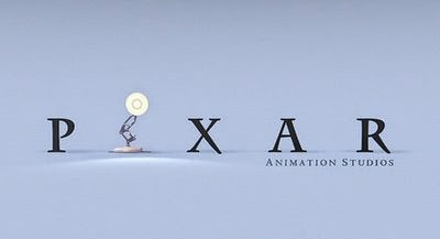
The Pixar production logo is a sequence that appears at the begining and end of most Pixar production movies, and features a playful desk lamp. The 1986 short film Luxo, Jr. is the source of the small hopping desk lamp included in Pixar's logo. The font is straightforward, as are the colours.

Miramax Films:
Miramax films, unlike the other logos, doesn't just have a plain background, but actually has the shape of the letter 'M'. Other than this, the logo is very simple, using just black and white colours for the font. Capitals are used, along with a straightforward font. Miramax films produced films such as Pulp Fiction, Bridget Jones's Diary and most recently, The Wedding Ringer.


After conducting research into different types of logos, I found that the most common, and also most effective logos use simple designs and colours. Typical colours such as black, white and grey and used for the background and font, and usually match up with whatever design the logo has itself. The more straightforward the logo, the more memorable it is for the audience, allowing them connect with it.

Research: Production and Distribution Company Logos (Jodie)


Film Institution Analysis -


PARAMOUNT PICTURES
Paramount's logo traditionally consisted of a mountain peak, a field of stars, and the name of the company in script font. The design dates back to 1914, and after all this time they have kept the simply but effective look, only adding a more 3D look and colour as coloured televisions were introduced.


DREAMWORKS

DreamWorks Logo is a trademark logo, with a very simplistic look, the most used image is the one of a boy sitting on a moon, with a fishing rod. This links to their brand as all of their films are animation and the idea of imagination, where the sky is the limit, this is also a good logo as DreamWorks mainly target young children. 
DreamWorks have worked on the likes of Madagascar, Turbo, Shrek and Kung Fu Panda, all of which have been great successes.  


UNIVERSAL PICTURES
Universal's main image on their logo is a World Globe, which could imply that their company is as it reads universal, it works for everyone and the concept is understood by all.
Universal have worked on films such as Jaws, Transformers and Fast & Furious. 


After researching a variety of logos I realised they all follow a trend of simplicity, less is more, each company chose a small, straightforward, uncomplicated image so that it will be memorable to the audience. Also, with each logo they all have unique theme songs playing over the top as the logo appears on screen, this allows the audience to connect physical imagery with sound, which means they are applying for more of their senses. 

Research: Production and Distribution Company Logos (Jenitha)


Warner Bros is a an American producer of film and television entertainment. The logo consists of a shield coloured gold and blue with letters ‘WB’ written over it. It states the name ‘Warner Bros Pictures’ across the shield and in the background they have a blue sky with clouds and at the bottom it says 'A TimeWarner Company'.


Universal picture is one of the six major movie studios and the logo has the globe in the middle with light shining out of the edges, then in the background there is dark sky scattered with stars, 'universal' is written in the middle over the earth.


20th Century Fox Film Corporations is an American film studios. The logo includes building like structures with '20th Century Fox' displayed on top of one of the buildings and there are also beaming lights which are being reflected towards the name.


Paramount Pictures is a film and television production and distribution company. The logo features mountains in the background with 'Paramount' at the tip of the mountain and then it is surrounded with a circle of stars. 


After researching on these different production and distribution companies, i have found out that every logo is unique and very different to represent the companies. The company logos are very simple and usually occur with some sort of a background music and the each company has chosen to go for a straightforward and a simple logo to make it memorable for the audience. Many of the companies that I have researched are very popular, for example, Warner Bros, Universal pictures, 20th Century Fox and Paramount Pictures.